NorthCoast
Brand Design
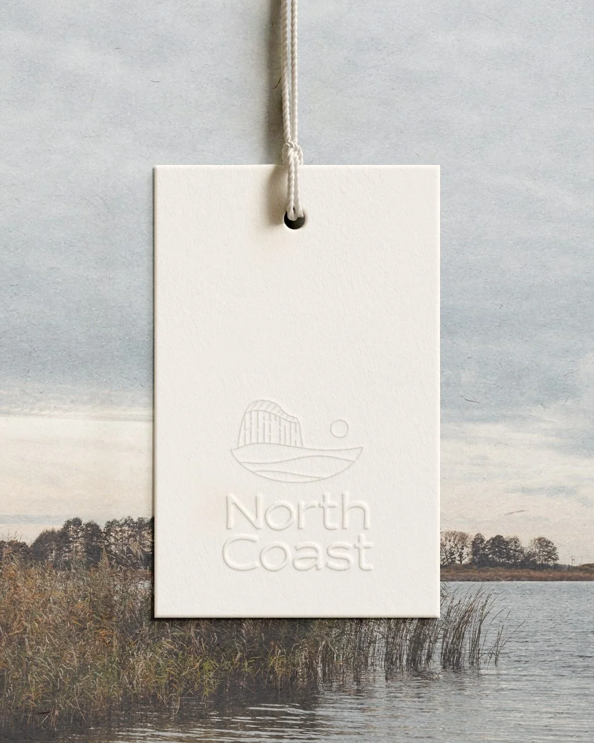
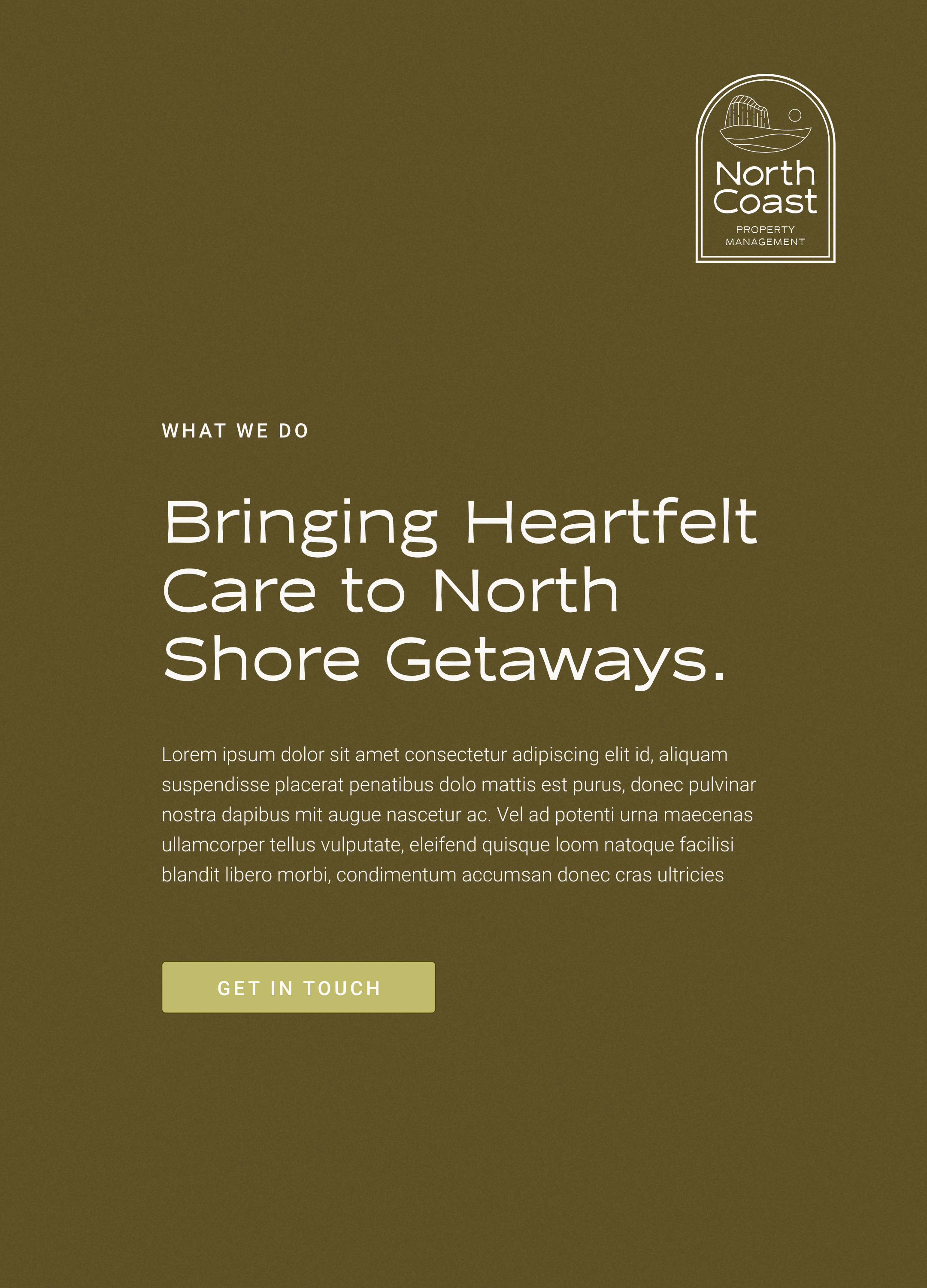
NorthCoast Property Management cherishes the adventurous spirit of the Superior North Coast Minnesota, curating short-term rentals for those seeking rest and a connection with nature. We crafted a distinguished logo suite, refined font styling, and a grounding color palette to mirror their dedication to seamless experiences and the Lake’s serene energy.
A look into our
Project Goals
Our goal was to create a brand experience that feels genuine, reliable, grounding, friendly, trustworthy, and relaxing. The earthy tones and fresh hues we selected evoke the serene and spirited essence of lakeside escapes, fostering warmth and joy. The cozy campfire-inspired logo, with a modern twist and hand-drawn details, feels like a summer memory. The logo type and serene coastal icon embody calm and adventure, while badge-like logos add a polished, nostalgic touch.


